
Fusion Rose Events Website Redesign
Role: UX/UI Designer
Tools: Adobe XD
Overview
While studying at Sacramento City College, I took on a UX/UI design project focused on redesigning a website using Adobe XD. I chose to reimagine the website for Fusion Rose Events, a local banquet hall, with the goal of improving both its visual identity and user experience.
Objective
The goal of this project was to create a more modern, user-friendly website that better reflects the venue’s purpose while making it easier for potential clients to explore services, view the space, and book events.
Context
This project held personal significance, as Fusion Rose Events is owned by someone in my community. The business was created to bring people together through events and to promote local engagement. This connection motivated me to approach the redesign with greater intention, treating it as more than just an academic assignment.
Process
I began by analyzing the existing website to identify areas for improvement in layout, navigation, and overall usability. From there, I explored design solutions in Adobe XD, focusing on:
- Cleaner layout structure
- Improved navigation flow
- Stronger visual hierarchy
- A more modern and inviting aesthetic
Solution
The final design presents a refreshed user experience that simplifies how visitors interact with the site while elevating the visual presentation of the venue. The redesign focuses on clarity, accessibility, and a more engaging browsing experience.
Reflection
This project helped me understand how thoughtful design can impact not only usability but also how a business is perceived. It also reinforced the importance of designing with real users and real communities in mind.
Design Process
Creative Brief

Figure 1. Creative brief outlining project goals, audience, and usability issues
Key Insights:
- Website lacked clear structure and navigation
- Important information was missing or hard to access
- Target audience needed a simpler booking experience
To better understand the needs of the project, I developed a creative brief outlining the client, target audience, and key objectives. This helped define the direction of the redesign and identify areas where the existing website was lacking.
The brief also highlighted usability issues, missing content, and opportunities to improve navigation and overall user experience
User Personas


Key Insights:
- Users struggled to find important information like booking details and event availability
- Navigation was confusing and inconsistent across pages
- Lack of content (such as testimonials and event visuals) reduced trust
- Users wanted a clearer way to explore services and community events
After developing the creative brief, I created a set of user personas to better understand the needs, behaviors, and challenges of potential users. Each persona represents a different type of visitor interacting with the Fusion Rose Events website.
These personas helped identify key usability issues and guided design decisions by focusing on real-world scenarios, ensuring the redesigned experience would be more intuitive and user-centered.
Information Architecture
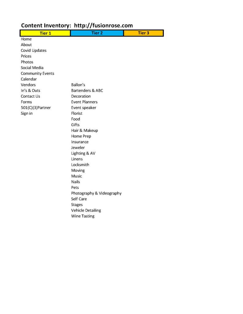
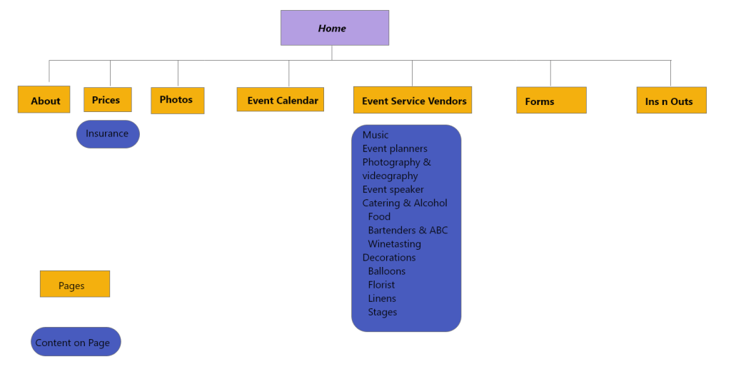
Figure 2. Revised site map improving navigation and content structure
Key Improvements:
- Simplified navigation by reducing unnecessary pages
- Grouped related content into clearer categories
- Improved access to key pages like events, pricing, and booking
- Created a more logical and user-friendly structure
Building on insights from the user personas, I conducted a content audit of the existing website to better understand its structure and organization.
I then developed a revised site map to improve navigation, simplify user flow, and ensure important information was easier to access. This step helped establish a clear foundation for the redesign by organizing content in a more intuitive and user-centered way.
Mind Mapping

Figure 3. Mind map used to explore content, audience, and feature ideas
Key Takeaways:
- Identified core services and event types to highlight
- Clarified target audience and use cases
- Defined essential website features and content needs
- Helped prioritize what should be included in the final design
Ideation
To explore potential directions for the redesign, I created a mind map to organize ideas around the business, its audience, and key website features.
This process helped me identify relationships between content, services, and user needs, allowing me to better define the scope of the project and prioritize essential features for the final design.
Visual Design Direction
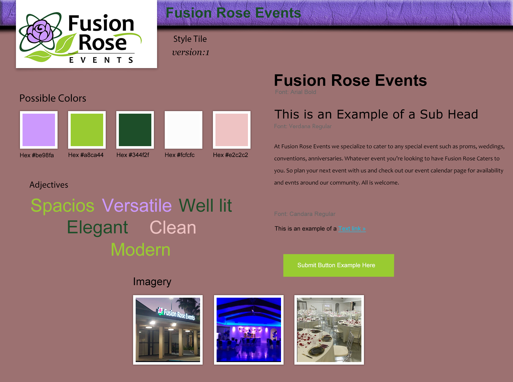
Figure 4. Style tile defining color, typography, and visual direction
Design Decisions:
- Selected a color palette that reflects elegance and warmth
- Used clean, readable typography for accessibility
- Focused on a modern and minimal aesthetic
- Incorporated imagery that highlights the venue and events
With a clear understanding of the user needs and site structure, I developed a style tile to define the visual direction of the website.
This included establishing a cohesive color palette, typography system, and overall aesthetic to reflect the brand’s identity. The goal was to create a modern, clean, and inviting look that aligns with the venue’s purpose while maintaining consistency across the user experience.
Wireframes & Prototyping


Figure 5. Low-fidelity wireframes exploring layout and user flow
Key Focus Areas:
- Clear navigation and content hierarchy
- Responsive layouts for desktop and mobile
- Improved user flow for booking and browsing
- Simplified structure based on earlier insights
With the structure and visual direction defined, I began translating ideas into wireframes to explore layout, hierarchy, and user flow.
I created low-fidelity sketches to quickly test different layout options, followed by more refined wireframes that led into interactive prototypes. This process allowed me to iterate on the design and ensure the experience was intuitive across both desktop and mobile devices.
These wireframes were then translated into high-fidelity designs to bring the final user experience to life.
Final UI & Prototype


Figure 6. Final high-fidelity designs for desktop and mobile views
Key Improvements:
- Clear and simplified navigation structure
- Improved content hierarchy and readability
- Mobile-responsive layout for accessibility
- Strong visual consistency using defined color and typography
In the final phase, I developed high-fidelity designs and an interactive prototype using Adobe XD. These designs translated earlier concepts into a polished and functional user experience across both desktop and mobile platforms.
The prototype allowed for real-world interaction testing, ensuring that navigation, layout, and overall usability aligned with user needs identified during research. This phase brought together the full design process, transforming initial ideas into a cohesive and user-centered solution
Interactive Prototype
Reflection
This project marked a turning point in how I approach design. It shifted my perspective from seeing web design as purely visual or code-driven to understanding it as a user-centered problem-solving process.
Through this experience, I developed skills in research, information architecture, and prototyping, while learning how to translate user needs into practical design decisions. I also gained a deeper appreciation for tools like Adobe XD and the role they play in building interactive and testable experiences.
Beyond design, this project strengthened my ability to manage complex workflows, organize ideas effectively, and approach challenges with a structured and strategic mindset.
 Welcome